Designing for multiple states in UI
When technology companies create interfaces in applications, whether we're talking about Android development or other platforms, they often focus on steering only toward an ideal final result that has been painstakingly defined beforehand. It's a common issue that designers deal with because it is easy to get a single, beautifully designed pattern and follow it.
Developers sometimes succumb to this way of thinking and focus primarily on creating a solution in the final state only. They get excited about how beautiful the app will look in the perfect state, and once the user displays the app in a different state, something unforeseen may occur.
Such an approach may cause a big problem because, very often, different users are exposed to multiple states of the app. So, if we don't focus on creating interfaces for other possible conditions, it can harm the result, i.e., how users will evaluate our solution.
Why designing for UI states is important to software developers
Sometimes designers tend to overlook the issues of the different states that an application may be in. When given a project to execute, development teams follow through on projects and do not consider other possibilities than the final, ideal outcome for one scenario. As a result, users may get a solution with bugs.
It, in turn, can lead to serious business consequences for the owner of the project. Therefore, it's always good for developers to focus on what the users might experience in UI. It will improve their applications and lead to more positive evaluations on the customers' side.
This article will give you insight into the different UI states that may occur and how you, as a developer, can best utilize them.
The ideal UI state – when everything is perfect
It describes how the screen looks when the content is well-displayed and the data is perfect. Usually, when someone thinks of UX design, the first thing that comes to mind is this state. It is error-free and is associated by developers with the application's target state. Since all the other UI states lead precisely to this one, it makes sense to start designing while keeping this in mind as a perspective.
The blank state – when there's a lack of UI elements
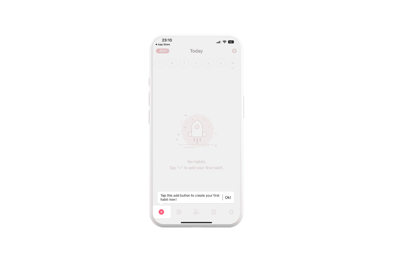
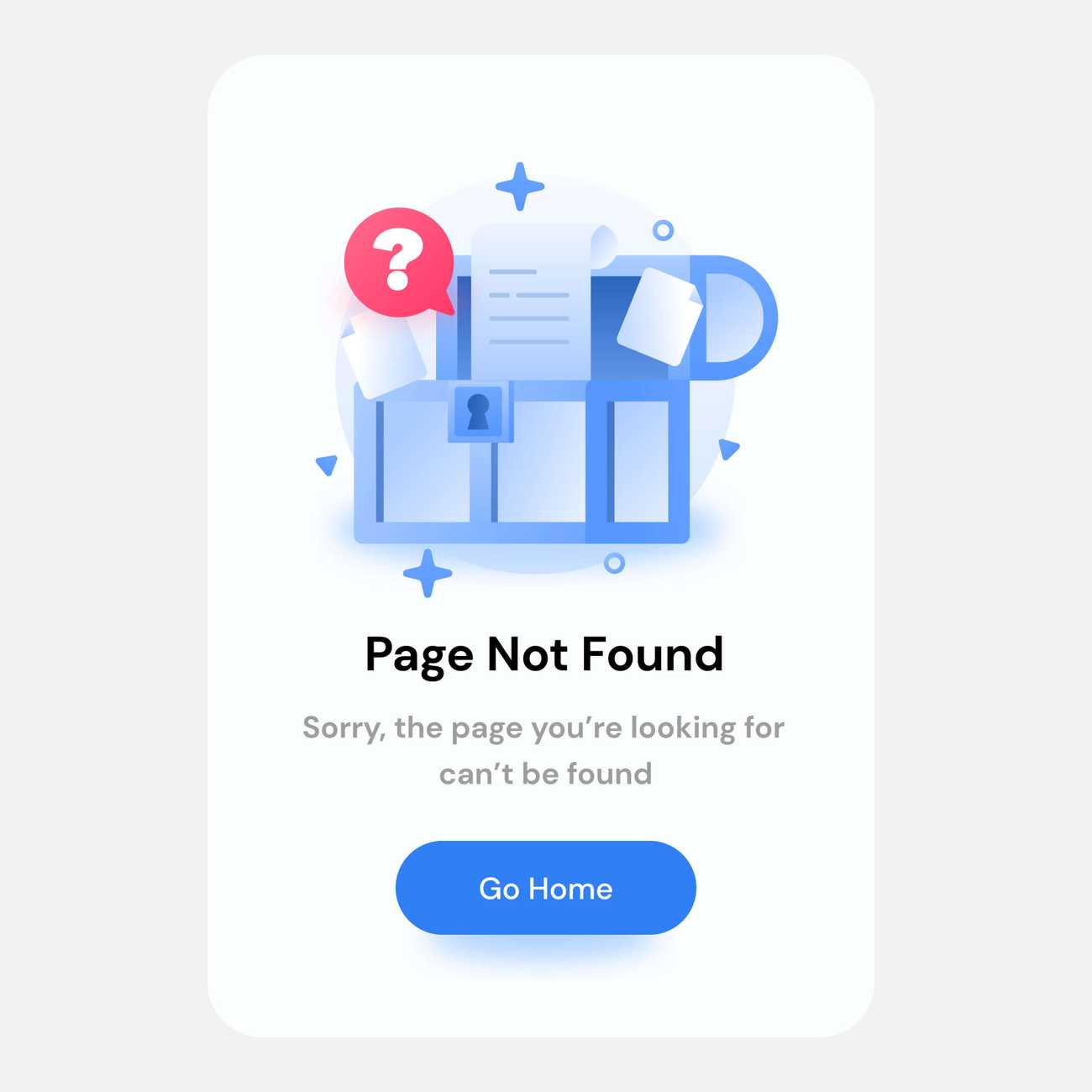
When no content is shown on the screen, we refer to this as a blank or empty state. For example, such a situation can occur when a user performs an action or searches for content but receives no results. It may be because there’s no such data in the app at the moment of searching.
These types of states exist most often in the following situations:
- The user has recently installed the application and is currently participating in onboarding. During the process, they can see places in the application where content still needs to be added.
- Unlike the above example, the user did something – deleted the content. For instance, they emptied the contents of their email inbox or deleted the contents of deleted photos from their iPhones.
- The user experienced an error through a lack of Internet access. In this case, they could get a message that there was a problem with their network access.
A quick example
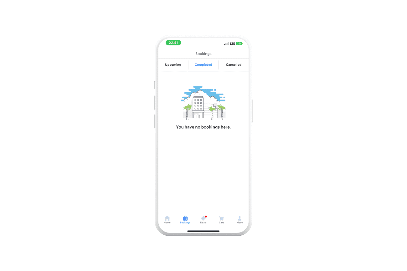
We can explain this UI state with the example of an application where you can book hotels, flights, and means of transport. For instance, on Agoda.com, users can preview upcoming trips or completed and canceled stays.
However, if they've recently started using the solution or simply haven't had a chance to add any visits yet, they will see a message on the screen that there are no bookings in the app.
How to approach this state
The first impression is significant in any UI state, so it makes sense to focus on making sure that during their journey through the app, the user is given the proper guidelines to get the right feeling and quickly reach the ideal state of the app.
The blank state is a transitional stage for someone who has just started using the app. That's why it's worth noting a few tips on approaching the user's interaction with the new blank state environment.
Imagine someone using your solution for the first time and encountering the empty state. If the user sees something like "There's nothing here" in the place where content should appear, they won't know what to do next.
So, a much better idea would be to show the customer how to move forward. You can achieve this effect with a simple, short description of what should be done in this place. Then, once the user completes the action, they will get what they expect. This way, they will take a step forward, and everything will be apparent.
What else you can do
To properly approach the design of this state, you can also ask yourself the following questions:
- After a user action clears the content, what happens on the screen?
- How does the screen communicate to the user that no content was found when a search returned no results?
- If a user views the screen for the first time, how does it look?
The loading state
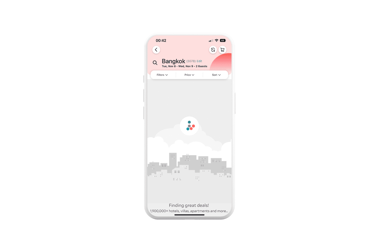
Sooner or later, as we develop an application of some kind, we will have to create a way to inform people that they will have to wait for something in the app. Since most software requires some action on the user's part or input by the user, this is unavoidable. As a result, we are faced with the so-called loading state.
What people do wrong
Unfortunately, during the creative process, some designers create only a white screen, which can cause users to lose patience. This is because, in this situation, people using the solution see that something is taking place, but they do not see the actual progress.
What can be done right
When an action is performed, the screen should properly communicate this so that the user knows what is happening. That way, they won't be annoyed and feel like they're dealing with an error.
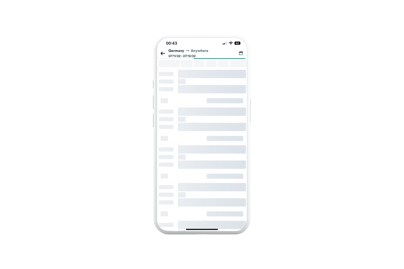
To adequately represent the state of loading data, we can use various elements such as spinners, progress bars, and skeleton screens. But which element is the best?
In 2013 Luke Wroblewski, an experienced product manager, pointed out in his article that using spinners and progress bars may seem like a good solution by design. Nevertheless, they make the user feel like he or she has to wait for the application content to upload.
People consider the upload time of an app's content extremely important, so it's worth doing something to give them the impression that the content uploads fairly quickly. Such a solution is the Skeleton Screen, a visual placeholder that we start to see before all the content is uploaded. An example can be Kiwi.com, which uses this solution, and we must admit it works quite well.
To make sure you design this UI state the right way, you can also ask yourself these questions:
- Does the user understand that the software is not responding?
- Does this loading indicator cause users to perceive the system as slow?
The partial state
It happens that only a fragment of the application is shown on the screen. It may be because the user has just started interacting with the content. So it's worth considering what the app should look like in the next steps and what we can do to make the user's transition to the ideal state smooth. To design these elements in the right way, it's worth asking yourself these three questions:
- When the user is only beginning to interact with the screen, what does it look like?
- If the user only adds one item to the screen, how does it look?
- Are there any ways to encourage users to interact more with the app?
LinkedIn will show you a progress bar of your profile, in order to show you that you can add more information to it, thus moving it closer to the perfect state.
The interactive state
An interactive state occurs when a user hovers or clicks on UI elements in the content. With such a UI state change, the person should be able to see what is happening. To achieve such results, the interface designer should focus on a few essential elements:
- What should the customer see on the screen when they click on an element?
- What should be displayed when the user hovers the mouse over any page part?
- Does the user know that the element changed due to their interaction with it?
- How does this element work when it's toggled?
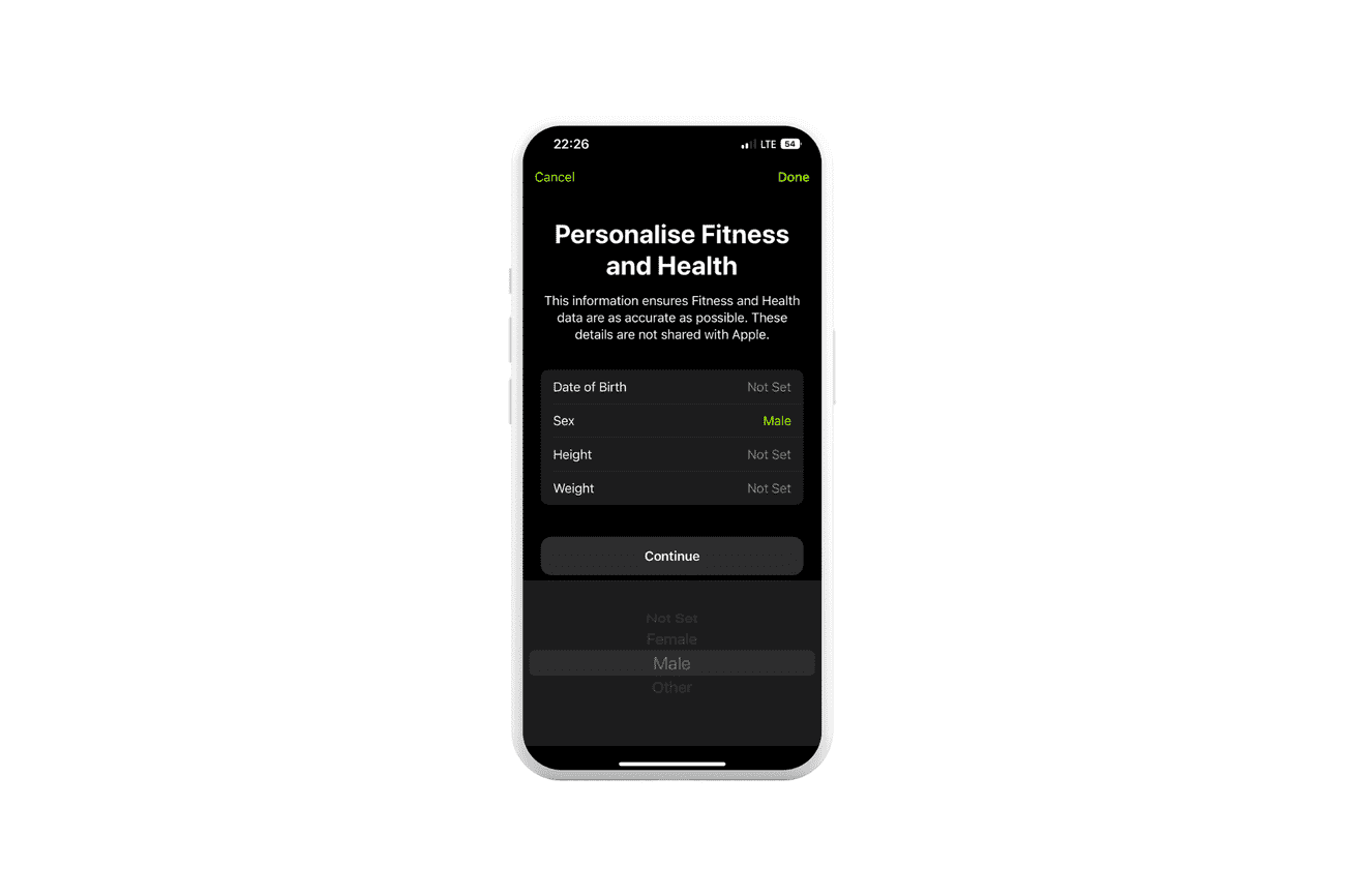
And here's an example of a simple take on the interactive state in the iOS Fitness app, where the user has to configure the app at the very beginning, entering specific data. When they select their gender in the panel, they immediately see their chosen option highlighted in green. In this simple way, the person using the solution can see from the beginning which activities they have already done.
The error state in UI
It is said that the best mistakes are those we don't make. So, developers try to create solutions in such a way as to minimize the risk of an error. Unfortunately, sometimes things go wrong, and just like in real life, we encounter an error in the app.
When does it happen?
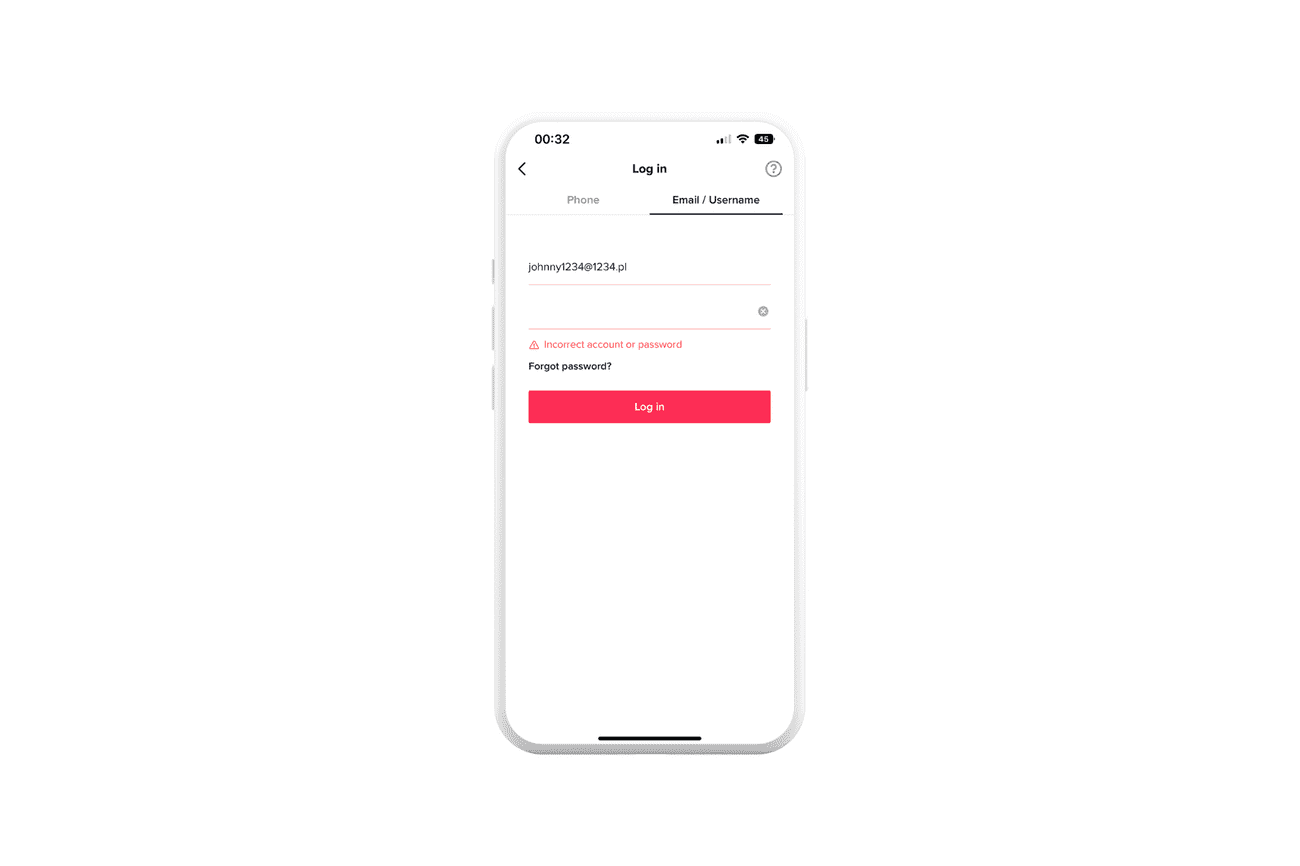
Error state occurs when there is an error in the application. In other words, the user gets something different than expected. There can be many reasons for such situations. From incorrectly entered data to inability to connect to the server.
It is worth noting that from the user's point of view, any such moment is perceived as an obstacle to the free use of the solution. Therefore, it is important to take the right approach to design this state.
Try to prevent it before it happens
The first step to take is to prevent what may occur in the future. To properly approach the design of the error states, it is necessary to know in advance what mistakes in the application users may make.
For example, users often have trouble filling out a form the first time they start with an application. They may enter the wrong information in the wrong place. In this case, it is a good idea to show users in the right place and in the right way what went wrong and what is worth changing.
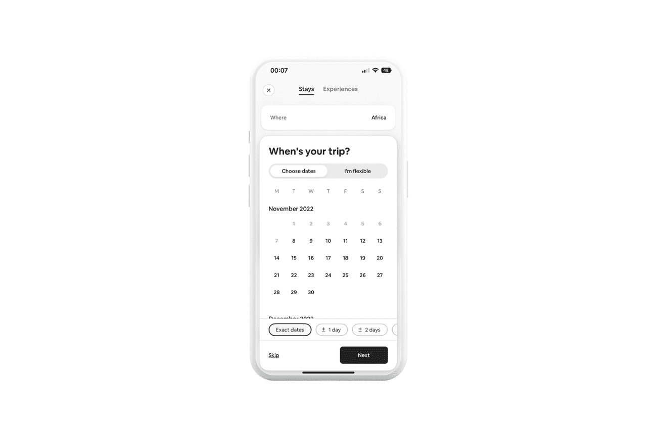
Another example is when users select a date on a calendar. Choosing past dates may lead to frustration when submitting the form if there are past dates available. It is worth thinking about making unavailable dates distinguishable from available ones, for example, by color.
Use the right place for messages
When a user makes a mistake in the app, you should adequately communicate the error and show them the information required to act correctly. In addition to the content itself, the location of such information is also essential, which impacts whether the person using the application can quickly understand and correct the error.
Hence, it is good practice to place the error information in the context of the action, close to where the user acted, for example, below the form where someone enters their data.
Choose the right color for errors
One important rule in UI states when communicating errors is to use the right color to make the message stand out and be easily identified with the error.
The most commonly used colors include:
- Red - for communicating an error
- Green - to acknowledge success
- Yellow - when you want to present a warning
- Blue - if you want to display additional information
Avoid using messages that don't support users
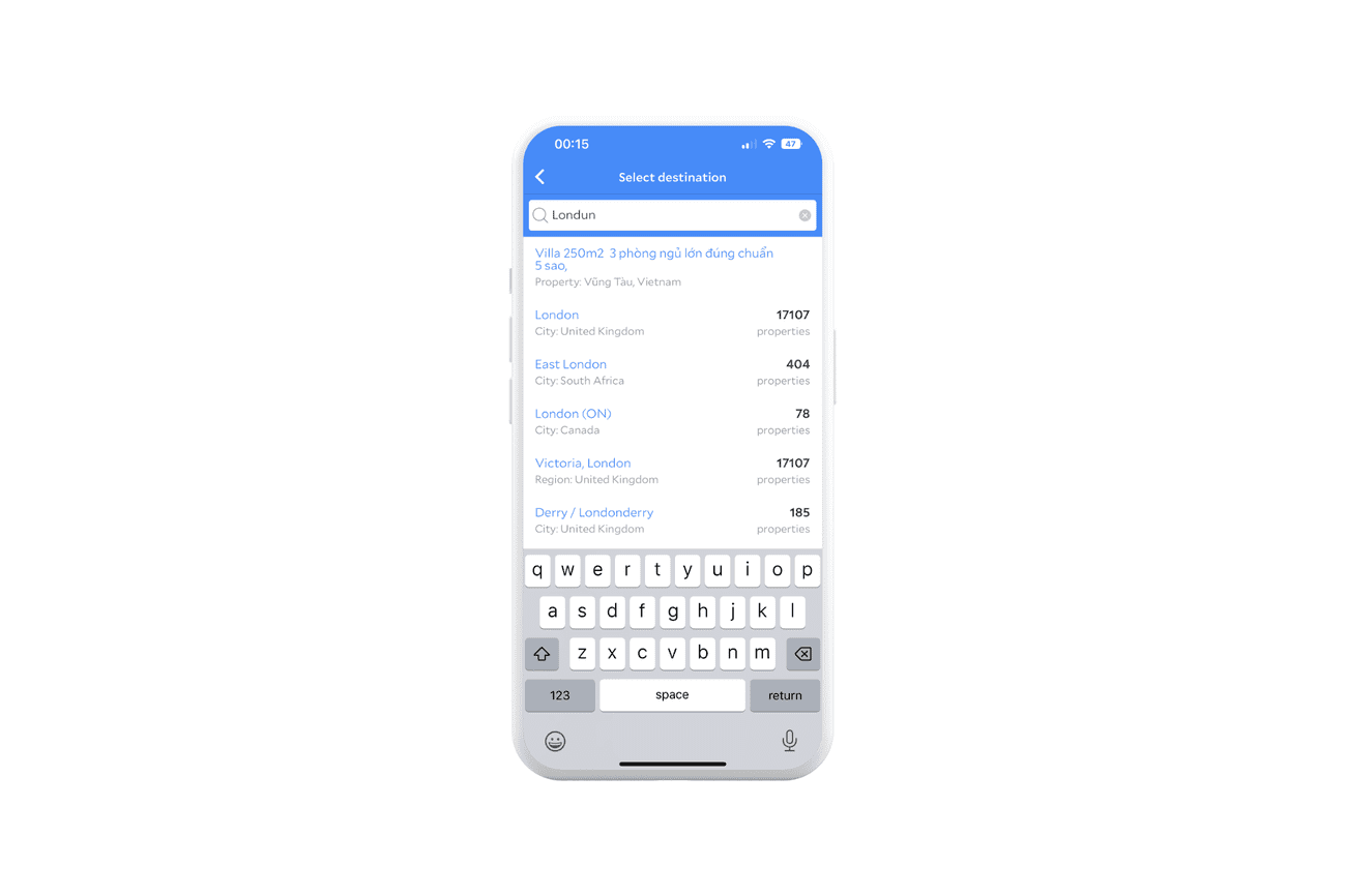
When someone makes a mistake, they may get frustrated seeing information that points out their bad move. Therefore, such a message not only adds no value to the user's life but can also cause a high level of frustration that, in extreme cases, can discourage the user from using the application. Instead of creating confusion, use your creativity and give the user concise information that directs them to a solution.
Take the Agoda.com mobile app as an example. If a user makes a mistake when entering a city they'd like to go to, the app suggests possible names, so instead of pointing out the error, it can guide the user to the right track.
Summary
Designing for individual UI states is a significant part of the design process. By creating a solution according to the various states, we can prepare applications that provide users with expected experiences. For developers, this is fundamental knowledge because not only will they know how to design a user-friendly solution, but they will also have a better understanding of the designers' work, increasing their knowledge of what they should do in their work.
