Creating Angular Tooltip Directive - Part 2: adding customisation
In my previous blog post, I explained how to create your own angular tooltip directive without using any third-party component libraries (like using angular material tooltip). Today, I will show you how to add more customisation to build a fully-fledged tooltip module.
Note: the whole code from this tutorial is on GitHub
Customising Angular tooltips
The tooltip directive created in tutorial part 1. should be good enough for many basic use cases. But in more complex situations, you may be tempted to install some dependencies to external angular tooltip libraries. Let's avoid this, and instead, let's take our own tooltip directive to the next level. Today, we will make it way more universal by adding a few features & options:
- tooltip position (below, above, left or right);
- tooltip themes (dark theme vs. light theme);
- tooltip delay time (separate tooltip delay show & tooltip delay hide);
- dynamic tooltip that follows the mouse cursor;
- support for touch devices / mobile devices.
Without further ado, let's jump straight into the first customisation.
Tooltip position - angular tooltips in the right place
So far, our tooltip was always displayed below the parent element. Now we will add an additional attribute position that will allow us to display it more flexibly. We will allow it to be placed below, above, left or right of the host element:
export enum TooltipPosition {
    ABOVE = 'above',
    BELOW = 'below',
    LEFT = 'left',
    RIGHT = 'right',
    DEFAULT = 'above'
}
To keep our code nice and clean, let's create tooltip.enums.ts file, where we will define enum types for all the available customization properties. In addition to apparent options for TooltipPosition (above/below/left/right), you can also define a default position in our enum.
Now, let's update the ts file of our directive to accept the position attribute as an @Input:
export class TooltipDirective {

  @Input() tooltip = '';
  @Input() position: TooltipPosition = TooltipPosition.DEFAULT;
In part 1 of this tutorial we created a method setTooltipComponentProperties(). In that method, we calculated the position of our tooltip relative to the HTML element on which the user hovers (to display it right below it). New version of this method will have separate calculations for each of the TooltipPosition options:
private setTooltipComponentProperties() {
    if (this.componentRef !== null) {
      this.componentRef.instance.tooltip = this.tooltip;
      this.componentRef.instance.position = this.position;

      const {left, right, top, bottom} = this.elementRef.nativeElement.getBoundingClientRect();

      switch(this.position) {
        case TooltipPosition.BELOW: {
          this.componentRef.instance.left = Math.round((right - left) / 2 + left);
          this.componentRef.instance.top = Math.round(bottom);
          break;
        }
        case TooltipPosition.ABOVE: {
          this.componentRef.instance.left = Math.round((right - left) / 2 + left);
          this.componentRef.instance.top = Math.round(top);
          break;
        }
        case TooltipPosition.RIGHT: {
          this.componentRef.instance.left = Math.round(right);
          this.componentRef.instance.top = Math.round(top + (bottom - top) / 2);
          break;
        }
        case TooltipPosition.LEFT: {
          this.componentRef.instance.left = Math.round(left);
          this.componentRef.instance.top = Math.round(top + (bottom - top) / 2);
          break;
        }
        default: {
          break;
        }
      }
    }
  }
We will also define the position property in the .ts file of our TooltipComponent:
export class TooltipComponent implements OnInit {

  position: TooltipPosition = TooltipPosition.DEFAULT;
     ...
The value of the position property is assigned in the setTooltipComponentProperties in the code above. We will use it to set a proper modifier to our CSS tooltip class...
<div class="tooltip"
     [ngClass]="['tooltip--'+position]"
     [style.left]="left + 'px'" [style.top]="top + 'px'">
  {{tooltip}}
</div>
...to properly align our tooltip in the desired position:
.tooltip {
   ...
  &--below {
    transform:translateX(-50%);
    margin-top: 7px;
  }

  &--above {
    transform:translate(-50%, -100%);
    margin-bottom: 7px;
  }

  &--left {
    transform:translate(calc(-100% - 7px), -50%);
  }

  &--right {
    transform:translateY(-50%);
    margin-left: 7px;
  }
}
I am using a BEM notation, so it will be eg. tooltip--below or tooltip--left, but feel free to adjust it to the CSS conventions of your project.
Also, if you added a small triangle indicating the tooltip anchor point, you should also adjust it for new positions. Below is just an example of the right-positioned tooltip, feel free to check the repo for the full CSS here: https://github.com/accesto/angular-tooltip-directive
.tooltip {
   ...
    &::before {
      border: 5px solid black;
    }
   ...
  &--right {
	...
    &::before {
      border-top-color: transparent;
      border-bottom-color: transparent;
      border-left: none;
      left: -5px;
      top: calc(50% - 5px);
    }
  }
And that is it:
<div class="cat-icon"
	[tooltip]="'Meow on the right!'"
	position="right">
</div>
Note: if your project setup (in tsconfig.json) requires angularCompilerOptions.strictTemplates you may need to import the enum type and use [position]=TooltipPosition.RIGHT instead of simple position="right".
Tooltip themes - angular tooltips that match your UI
Our next customisation will allow us to use our tooltip in both light and dark UIs.
Again, we will start by defining an enum type for our TooltipTheme options:
export enum TooltipTheme {
    DARK = 'dark',
    LIGHT = 'light',
    DEFAULT = 'dark'
}
Depending on the theme, we will adjust the tooltip background, and of course the tooltip text colour. We also have to adjust the tooltip anchor point (small triangle) to match the tooltip background:
.tooltip {
   ...
  &--light {
    background-color: white;
    color: black;

    &::before {
      border: 5px solid white;
    }
  }

  &--dark {
    background-color: black;
    color: white;

    &::before {
      border: 5px solid black;
    }
  }
   ...
}
And to make use of these themes, we have to pass the theme property to our component template the same way as we did with the position. I will skip that part here but feel free to check the complete code in the repo: https://github.com/accesto/angular-tooltip-directive
Tooltip delay time - instead of showing the tooltip immediately
Now, let's play a little bit with the tooltip behaviour. So far we just wanted to show the tooltip immediately when the user's mouse hovers over the selected HTML elements. But common practice is to show the tooltip after the user hovers over the tooltip's trigger element for a longer period (measured in milliseconds) - which may indicate that he needs some help or explanation. Let's add some delay time before we make our tooltip visible. Options are two - we can either instantiate our tooltip component after the delay, or do it immediately, but play with its opacity. I'll go with the second option, as it will give more options to control the potential show animations/transitions:
.tooltip {
  opacity: 0;
   ...
  &--visible {
    opacity: 1;
    transition: opacity 300ms;
  }
}
To control visibility, we have to define visible: boolean = false property in our TooltipComponent and use it in the class directive:
[class.tooltip--visible]="visible"Let's now add setTimeout() to our onMouseEnter() method of our tooltip directive:
 onMouseEnter(): void {
   if (this.componentRef === null) {
       ...
      this.setTooltipComponentProperties();
      this.showTimeout = window.setTimeout(this.showTooltip.bind(this), this.showDelay);
    }
  }

  private showTooltip() {
    if (this.componentRef !== null) {
      this.componentRef.instance.visible = true;
    }
  }
Where this.showDelay (defined in milliseconds) will of course be another @Input() property of our angular tooltip directive. For formality, let's also clear the timeout if the user's mouse leaves the tooltip's trigger element:
destroy(): void {
  if (this.componentRef !== null) {
    window.clearTimeout(this.showTimeout);
    ...
  }
}
The same we can do with the hide delay. For that, we need to modify onMouseLeave() method of our angular tooltip directive:
 @HostListener('mouseleave')
onMouseLeave(): void {
  this.hideTimeout = window.setTimeout(this.destroy.bind(this), this.hideDelay);
}
Again, hideDelay will be an @Input() property that will define closing time in milliseconds. And of course, we also have to clear the timeout of our close delay in case the user hovers again over the parent element.
And that is it - see an angular tooltip example in action, with delays for showing and hiding the tooltip:
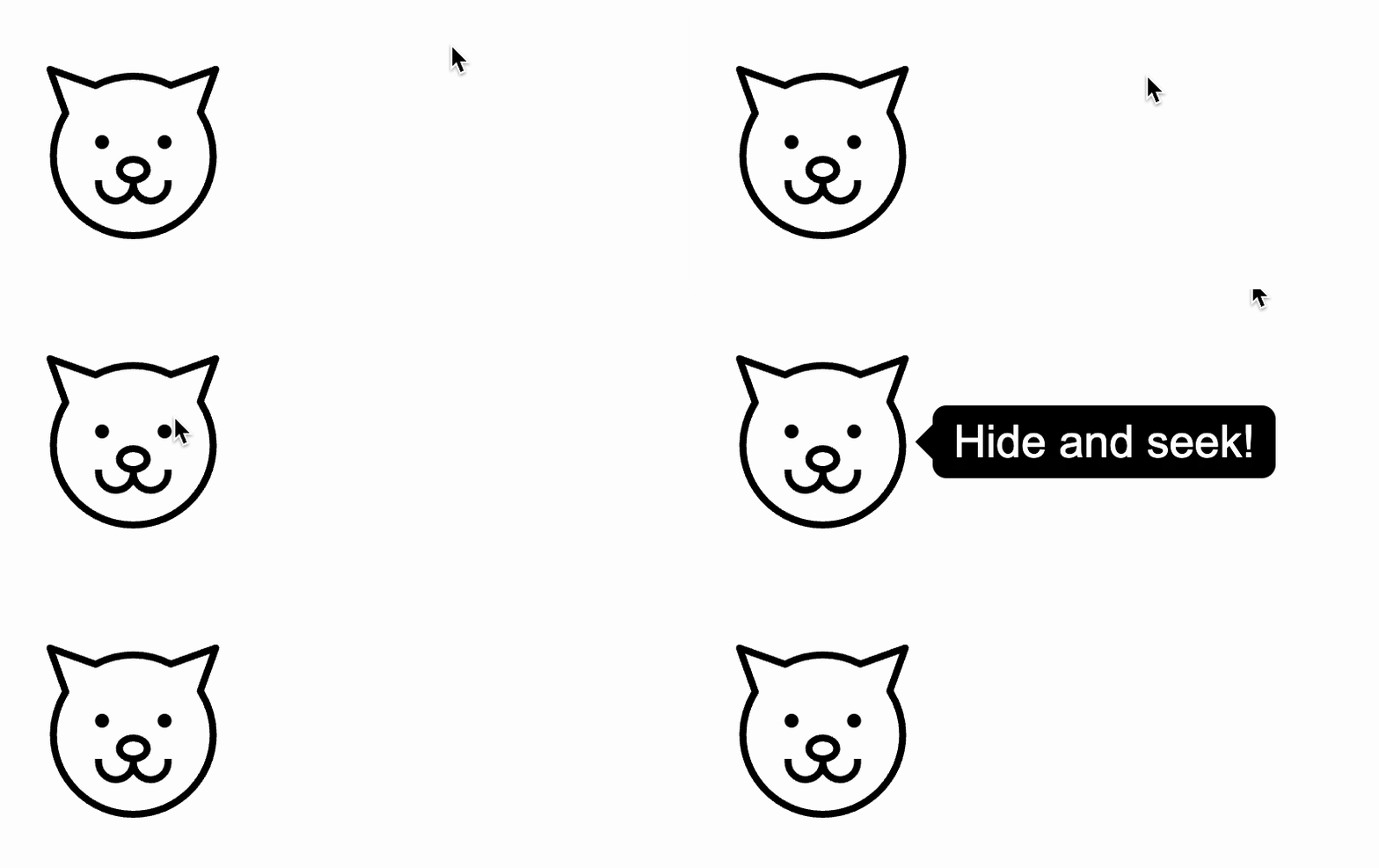
You could also add some hiding animation/transition after the hide delay, but I will leave that to you.
Dynamic tooltips - eg. when the user hovers over an area
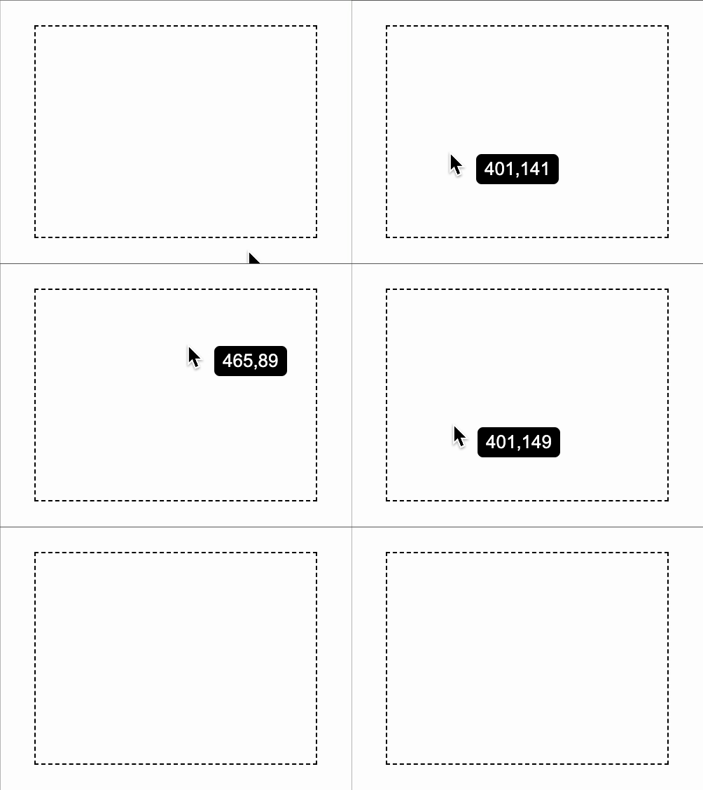
Tooltips, as the name suggests, are often used to provide additional information on tools that users have in the UI. Let's assume you are building an online graphics editor. It's a common case, to show the mouse coordinates over the editor canvas. For that, we will need a tooltip that won't appear in one place, but will rather follow the user's mouse. For that, we will let our angular tooltips listen to pointer events, and update their position whenever the user moves the cursor. Let's call it a dynamic tooltip position:
export enum TooltipPosition {
    ABOVE = 'above',
        (...)
    DYNAMIC = 'dynamic',
    DEFAULT = 'above'
}
We could also define the tooltip position left/right/below/above the mouse cursor, but let's not overcomplicate this and stick to just the default behaviour. We will simply display the tooltip next to the cursor, and will hide the anchor point:
&--dynamic {
  margin-left: 20px;

  &::before {
    display: none;
  }
}
Listening to the pointer events is quite straightforward, we just need to add another @HostListener that will update the position of our angular tooltip whenever the user moves the mouse:
@HostListener('mousemove', ['$event'])
  onMouseMove($event: MouseEvent): void {
    if (this.componentRef !== null && this.position === TooltipPosition.DYNAMIC) {
      this.componentRef.instance.left = $event.clientX;
      this.componentRef.instance.top = $event.clientY;
      this.componentRef.instance.tooltip = this.tooltip;
    }
  }
You may be wondering why we also update the this.componentRef.instance.tooltip? It's because otherwise, we won't be able to dynamically update the tooltip content. This allows us to achieve tooltips like these:
Support for touch devices - mobile tooltips
Last but not least, we will focus on making our tooltip module compatible with mobile devices. What's different on mobile? Lack of the mouse pointer of course! So how we can show our angular tooltip if the user cannot hover his mouse over anything? It's quite simple actually. We just need to adjust our tooltip directive and in addition to pointer events, listen also to touch gestures.
First, let's determine what kind of gestures we want to detect. Shall we show the tooltip whenever the user taps (touches) some button or other HTML content? That would be quite straightforward to implement, but would actually prevent users from using that button. We still have to allow all the standard taps for the normal usage of the UI. Instead, let's detect the situation when the user long presses the screen over the HTML content. But how do we define the long press?
Unfortunately, there is no touch event that would express the long press. But no worries, we can combine touchstart and touchend events, to detect if it was indeed a long press.
So far we have been initialising our tooltip right inside the onMouseEnter method. Now, because we will have more than one trigger than the mouse, let's move the initialisation to a separate method:
@HostListener('mouseenter')
  onMouseEnter(): void {
      this.initializeTooltip();
  }

  private initializeTooltip() {
    if (this.componentRef === null) {
	...
And we will use that method also after we detect the long press:
@HostListener('touchstart', ['$event'])
  onTouchStart($event: TouchEvent): void {
    $event.preventDefault();
    window.clearTimeout(this.touchTimeout);
    this.touchTimeout = window.setTimeout(this.initializeTooltip.bind(this), 500);
  }

  @HostListener('touchend')
  onTouchEnd(): void {
    window.clearTimeout(this.touchTimeout);
    this.setHideTooltipTimeout();
  }

  private setHideTooltipTimeout() {
    this.hideTimeout = window.setTimeout(this.destroy.bind(this), this.hideDelay);
  }
Simple as that, now our angular tooltips are ready for mobile devices. Cheers! 🍺
Summary
In part 1 of this tutorial, we created a custom angular tooltip directive for displaying very basic tooltips. Part 2. brought many customisations to our tooltip module. You should now be able to use it in most of your angular applications. Sure it still has fewer features than the best angular tooltip libraries (like an angular material tooltip), but if you miss some features, feel free to extend it further.
You can play with the default options & default values like default delay. You can add further settings like font size or passing custom css class. Or you can even consider creating an angular tooltip service, for non-manual triggers (to show/hide the tooltip programmatically).
I will leave it to you. And in the meantime, you can check the complete code of the angular tooltip directive from this tutorial here: https://github.com/accesto/angular-tooltip-directive

