Usability heuristics – principles that differentiate good and poor UX
The UX world focuses on making users get the most out of applications and user interfaces. Since there are hundreds of millions of apps worldwide and the number of apps is constantly growing, user experience has gained a lot of importance.
In the age of rapidly developing and changing technologies, many IT departments focus primarily on technological innovations, causing good UX to take a back seat. So, today we will describe 10 Usability Heuristics created in the 1990s by J. Knapp Nielsen. Even though these principles have been known for over 30 years, they remain valid and relevant today more than ever. To show you why these heuristics work, we will also present a few practical examples of how businesses apply them and how you can use them in your work.
Visibility of System Status
"The system should always keep users informed about what is going on, through appropriate feedback within reasonable time." (Jakob Nielsen)
People need to feel in control at all times. Whether in childhood when we fight with another child over a toy or in adulthood when we have to navigate a confusing world of bureaucracy, media upheaval, and ongoing technological advancement. It reflects how we view the world.
At the same time, when we perform concrete steps, we want to be sure that our actions are correct and that we understand what will happen next. Otherwise, we will not only lose control of the situation but also become confused about what is supposed to take place later.
What this rule means
This principle states that the user should be aware of what is happening in the system when using the app. It allows them to see the outcome of their previous actions and trust the application enough to perform additional actions.
If the user is unsure of the system's status, they may get confused. Consequently, they can become dissatisfied with the application and may even stop using it.
Let's look at some examples
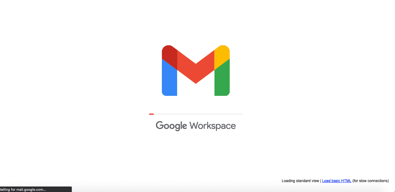
Google Workspace is a common example of an application where developers look at user interface design from this angle. When the user logs into the mail, they see a simple animation with a progress bar, a sign that the regular mailbox will show up soon.
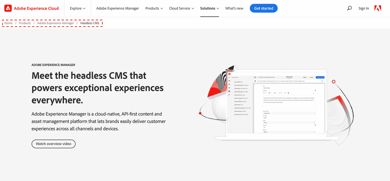
Another example of this principle's use is the so-called Breadcrumb Navigation. It indicates where the user is currently located and information regarding what path this person has taken so far. In practice, we can see the various subpages we have visited, so it's easy to understand where we are on the website. In practice, we see a simple list of pages the user has visited. Below you’ll find two examples of websites where we see Breadcrumb Navigation after selecting subpages.
You can also find good examples in the offline world, where various devices signal to the user in real-time what is happening at any given moment:
Cars: When you turn on your car's engine, the lights on the dashboard indicate what has been checked and that the vehicle is ready to start.
Elevators: When users select a particular destination, the panel inside the elevator will display the floor they're on.
Not only are visual triggers used to show the status of the system, but also the state the system is currently in. Therefore, we distinguish the following states of the system:
- ideal state – how the app looks in the perfect view.
- blank state – what the screen looks like without content.
- loading state – when the content is loading, or some other thing is taking place.
- partial state – when only a piece of the content is shown.
- imperfect state – when the content is not optimal.
- error state – when an error appears in the app.
- success state – when a user in the app performs some action and finishes it.
This is an essential element of a good UI, and we will soon publish a separate article about what you should keep in mind when designing apps.
Match between system and the real world
"The system should speak the users’ language, with words, phrases and concepts familiar to the user, rather than system-oriented terms. Follow real-world conventions, making information appear in a natural and logical order."
Our life experiences create our world and shape our future in digital reality. When we enter the virtual world, we bring our expectations and mindsets created in our offline environment. It makes it much easier for us to understand something similar to what we have seen.
According to Nielsen's second principle, when developing technological solutions, we should use terms and expressions that our users recognize and are typical of offline life.
Besides mapping reality, we should avoid specialized jargon because our users may not understand it. At the same time, the elements of the app must adhere to the logical order we are familiar with from reality.
Are there any examples?
A vast number of concepts we've become accustomed to in our offline lives are reflected today in the virtual world. Many of the shapes resemble natural objects we know from everyday life. The simplest example of this approach is the construction and mechanics of icons on our smartphones and laptop screens.
When a file is moved to a trash bin, for example, the icon on the desktop transforms into a trash can filled with paper. It indicates to the user that the action performed yielded the expected and logical result.
User control and freedom
"Users often choose system functions by mistake and will need a clearly marked “emergency exit” to leave the unwanted state without having to go through an extended dialogue. Support undo and redo."
Probably each of us has used some application rushing. Because we frequently act rashly in such situations, it is easy to make a mistake in this case. Choosing an incorrect option or pressing a wrong button can be really frustrating and, in some cases, have negative consequences.
Users should have the option to decide whether to move forward with their actions or leave the unwanted state. It creates a sense of freedom users expect and lets them feel in control.
This backward path could be represented by a cross, a "Cancel" or "Undo" button, or some other arrow-like shape that would make it crystal clear to the user that they can back out.
One excellent example of a mechanism that provides security and choice is the Undo functionality in Gmail. Within a few seconds after pressing Send, the user sees an Undo function on the screen. By clicking this button, they can stop the action if they decide they don't want to send the email.
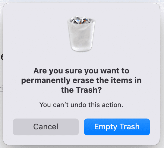
Similarly, macOS users can remove their unwanted files from the system when they click the Empty Trash button. The system must ensure that they make this decision consciously, so it displays a message that allows them to confirm or cancel their choice.
Consistency and standards
"Users should not have to wonder whether different words, situations, or actions mean the same thing. Follow platform and industry conventions."
Have you ever wondered why so many elements in different applications work on a similar principle? What causes you to pick up a new application and quickly figure out how each feature works?
The answer is simple. The authors of these solutions often use concepts familiar to users because people have experience using various solutions and transfer their skills to their following applications.
For example, smartphones use screen swiping to move between desktops and clickable desktop icons. If someone has used smartphones or touchscreens, they will most likely have no problem understanding that icons are also clickable on another phone because a habit causes the user to assume this is how it should work.
In the offline world, the most straightforward analogy might be doors, which have existed in most homes since dawn. Despite introducing new models and exciting solutions to the market from time to time, most door manufacturers produce these products with the idea that even a novice user will know that a handle is used to open the door. For customers, such door construction is evident.
Error prevention
"Good error messages are important, but the best designs carefully prevent problems from occurring in the first place. Either eliminate error-prone conditions or check for them and present users with a confirmation option before they commit to the action."
One of the most basic human truths is that we all make mistakes. Whenever we're at work or using various devices and applications, we can fall into traps. That's our nature, and it's why one of Nielsen's ten principles states that users must receive clear, lucid information about an error.
However, if we want users to feel safe and have adequate interaction with the application, we should minimize the risk of user error in the first place.
According to Nielsen's heuristics, when creating a good application design, we should pay strong attention to the fact that mistakes can occur in human-computer interaction.
Therefore, we should make the right conditions for using the application to eliminate the likelihood of an error as much as possible. If the user is about to perform an action, we should show them a confirmation so they can determine whether they want to make that move.
If we were to think of an example from the real world, the most accessible place to apply this principle would be barriers on a mountain road. They serve the purpose of stopping the car from skidding off the road when a driver makes a mistake.
Analogous reasoning is often used in applications. When a user selects an option, a notification appears asking if they are sure they want to perform this action.
For example, imagine writing an email in Gmail. You want to send some attachments but forgot to include them in the message. Google has created a feature to help you with that.
Before you send the email, you get a notification asking if you are sure you want to send the email without the attachment. Such a reminder keeps users informed about the potential risk, and as they say, prevention is better than cure.
Recognition Rather Than Recall
"Minimize the user's memory load by making elements, actions, and options visible. The user should not have to remember information from one part of the interface to another. Information required to use the design (e.g. field labels or menu items) should be visible or easily retrievable when needed."
Memory retrieval is classified into two types: recognition and recall. When you can easily recognize a person or an object you are familiar with, we can refer to it as recognition. It is a simple form of memory retrieval that requires no effort.
However, when you need to find some information you haven't used in a long time, you use recall (surnames, addresses, and other details). People simply must activate more memory chunks to recall information.
As a result, the recall process is a more in-depth retrieval that needs more effort. That's why most people will tell you that it's easier to answer multiple-choice questions than open questions.
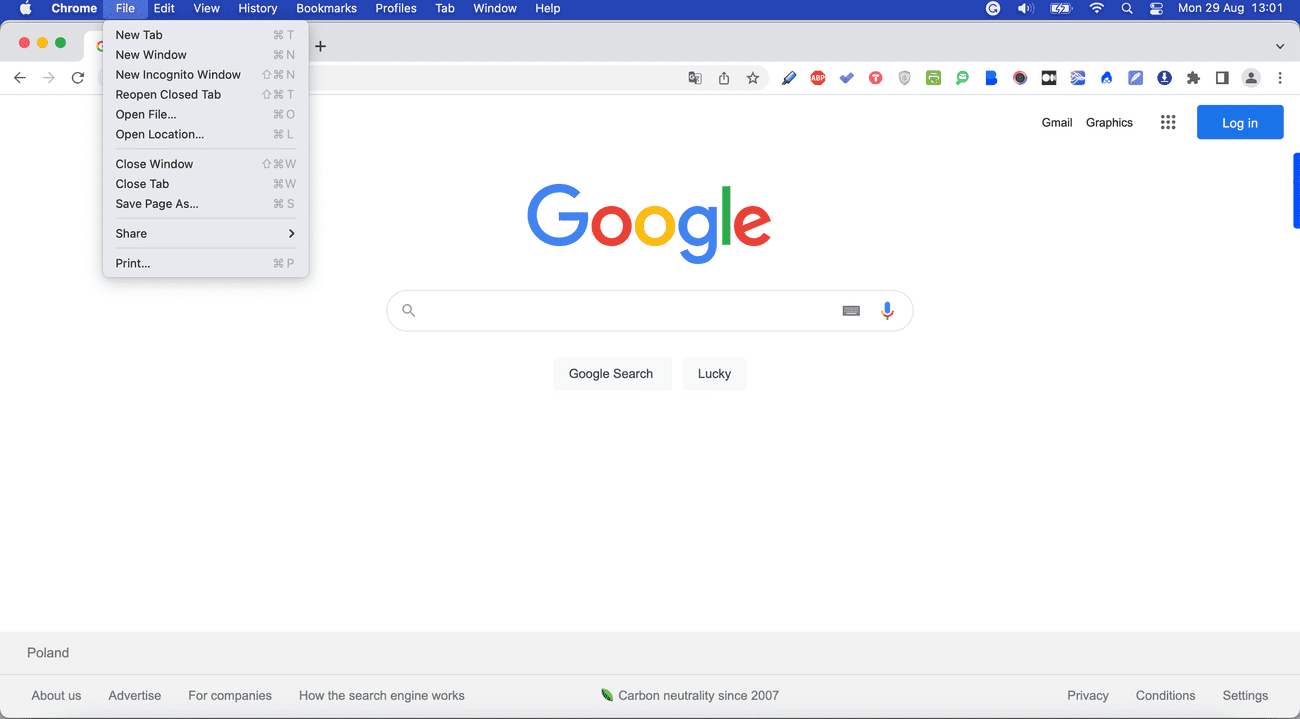
Using a simple menu in browsers is an example of the Recognition Rather Than Recall principle. When a word is clicked, a list of specific functions available to the user appears. It is far easier for the user to select one of the visible options in a user interface than to use a terminal and type from memory the combinations that display specific information.
Understanding this principle has enabled computer, tablet, and phone developers to make an incredible technological leap over the years. As a result, equipment use has become much more user-friendly and accessible.
Tooltips are also a great example of that principle they are always there for you, when you need them the most, at least they should be. And if you are wondering how to create your own Angular Tooltip Directive - we have a short tutorial for you.
Flexibility And Efficiency of Use
"Accelerators — unseen by the novice user — may often speed up the interaction for the expert user such that the system can cater to both inexperienced and experienced users. Allow users to tailor frequent actions."
When a novice starts using the application, they need a sense that the solution is simple and its options are understandable enough for them to use it. Such a person expects, for example, that the options will be clearly labeled and adequately described, and there will be no shadow of a doubt as to what steps to take.
Advanced users, on the other hand, are already familiar with the solution and, when using the application, expect to be able to use shortcuts that will allow them to use the software faster and more efficiently. Each system should be flexible enough for both people to find their way around the solution.
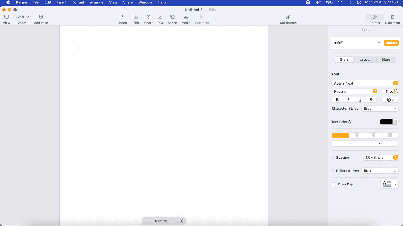
An example is the Pages application in Macs, where users see the essential functions needed to create content in the main view. At the same time, more advanced specialists can take advantage of various shortcuts that allow them to work faster.
Aesthetic and minimalist design
Users don't like to see lots of information that can confuse them in an app. That's why minimalism has been used for several years to enhance the aesthetics of the solution's appearance and focus on elements important to the user. Minimalism allows users to discern the answer faster and thus achieve the expected results more quickly.
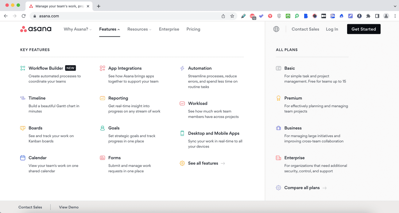
An example of how this concept is implemented is the way icons are arranged on landing pages. Such icons frequently take the shape of a minimalist design that omits numerous features and expresses a fundamental notion through a simplistic form. Below you can see how Asana uses this rule on the website.
Authors of IT solutions often use tooltips to achieve a minimalist look in the system. A tooltip is a UI pattern that guides users through their journey as smoothly as possible. When customers use your product, carefully designed tooltips help them learn and engage. This improvement of UX leads to higher engagement, usage, and adoption rates. If you’d like to know more about this concept, you can learn how to make your tooltip directive by checking out our article.
Help users recognize, diagnose, and recover from errors
"Error messages should be expressed in plain language (no error codes), precisely indicate the problem, and constructively suggest a solution."
When we use an app, sooner or later, mistakes and errors will happen. Any obstacle that stands in our way, whether brought on by our actions or was only a mistake in an internal application, can be frustrating. That's why we should prioritize making the error message experience as refined as the system to spare users' anxieties.
This Nielsen principle states that systems should present each error in a form the recipient can comprehend, along with a description of the issue and a potential fix. Doing this is essential to avoid using technical jargon because using complicated language increases user confusion and irritation.
To illustrate an example, we can go back here to Gmail, which lets you stop the email from being sent using the Undo button. This message offers a straightforward solution – you can decide whether you want to go further with this action or stop the process. You can save the day and feel comfortable with your choice.
Help and documentation
"It’s best if the system doesn’t need any additional explanation. However, it may be necessary to provide documentation to help users understand how to complete their tasks."
As we mentioned earlier, not every user knows the app enough to use the solution's true potential. Therefore, in addition to careful design, we should provide the users with help and documentation they can look into daily.
At the same time, we should make sure that the documentation is written in an understandable language. Besides long descriptions of functionalities, we can also use a well-done onboarding process; a library with video tutorials or in-app guidance can greatly support users.
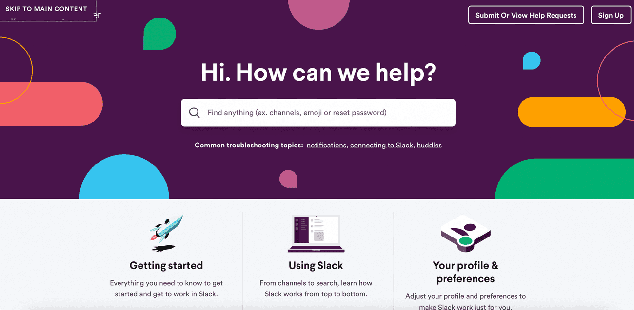
An excellent example of how user support can be robust is Slack's post-installation app support. The user becomes familiar with the system during the first few minutes using a simple guide inside the app.
Slack also has an extensive help center, where you can find answers to all your questions and learn how to use the solution's various functionalities.
Universal principles of user interface design and UX
Nielsen's 10 Usability Heuristics provide an opportunity to take a better look at the application development process and create computer software that is responsive to users' needs while creating a user-friendly environment for them to maximize the solution's potential in their daily work. Of course, good design requires much more knowledge of UX, but using these ten heuristics is an excellent starting point for moving forward.
If you look further for more advanced insights on improving your UX, check out our blog post “ 5 tools for Core Web Vitals to measure and improve website UX”.
