How to create your own Angular Tooltip Directive - a short tutorial
Tooltips may seem insignificant, shy, and sometimes neglected. But they are real superheroes of many user interfaces. And like superheroes, they appear from nowhere, right when you need them, exactly where the help is needed. But, what is their superpower?
Tooltips are really powerful at delivering information. They are a perfect way to provide contextual help, without overloading users with too much information at the first glance. Tooltips appear wherever users need some additional data or explanation. No sooner, no later. This allows you to maintain the UI nice, clean and minimalistic.
Providing help in form fields, explaining complex features or tools, displaying additional information over charts... There are many ways tooltips can improve the user experience of your application. So if you are a front-end developer building an app in Angular, there is a huge chance that sooner or later you will be adding tooltips here and there.
How to add tooltips to an Angular app?
Before we dive into creating our own Angular Tooltip Directive, let's see some other ways to add tooltips in the Angular app. One of the most popular ways is to use the Angular Material component library. It provides a large set of components that follow the Google Material Design system. Another common UI library that you can consider is ng-bootstrap - it is an Angular version of the previously most popular HTML/CSS/JS library in the world - Bootstrap. If you seek something more lightweight yet powerful, you can also check ng2 tooltip directive.
So why should I create my own Tooltip directive in Angular?
With so many tooltip solutions available, creating your own tooltip directive may seem like reinventing the wheel. But here are some reasons why you still may want to consider building it from the scratch on your own:
- Because you don't want to rely on yet another npm package or you just want to keep your app lightweight - without adding the whole Angular material to achieve tooltips;
- Because you may need more customisation to your tooltip style (like light theme vs dark theme) or behaviour (eg. dynamic tooltips that follow your mouse - I will cover that in part 2. of this tutorial). You may also want to add some directive options like content type, custom hover options (animation, hide delay, show delay) or a support for touch devices / mobile devices;
- Because you may be building a whole component framework for your app and want tooltips to be part of it;
- Last but not least - because you may want to learn how to build angular structural directives, and although there may be some simpler directives to start with, tooltips will give you a good lesson.
So if you already decided to build your own tooltips, let's see how we can approach that task and what building blocks of Angular shall we use.
Tooltip as a Directive, Component or as Service?
It depends, of course 😉 The same way as a custom button in Angular can be implemented as a standalone component tag, or as a directive applied on a standard HTML tag. Today I will show you how to implement a tooltip in Angular as a directive because I find it the most common use case. Usually, tooltips don't live on their own (like Components) and don't need to be invoked programmatically (via Services). They are usually add-ons to existing HTML content, and that is where structural directives work best.
But as your use case may be different, you may consider implementing tooltips as an:
- Angular Directive - plain and simple, just an add-on to existing HTML code, usually containing just a string or a short text;
- Angular Component - when you need to place inside a tooltip something more sophisticated than a text or an image, eg. some additional data above an interactive chart, or even to make universal tooltips that can display any given content inside the ng template tag;
- Angular Service - mostly if you need to programmatically add or manipulate tooltips from the TypeScript code, eg. from within the functions of other components or services.
Creating Tooltip Directive in Angular - step-by-step recipe
Ok, so let's start from the short todo list with the steps required to build our reusable tooltips:
- Create a tooltip component with a template;
- Define tooltip background and other styles;
- Create a tooltip directive;
- Add basic tooltip logic;
- Wrap it up in the tooltip module;
- Give it a test ride!
And here is a list of necessary ingredients for our Angular tooltip directive recipe:
- 1 component - to define a template and a style of our tooltip;
- 1 directive - to attach tooltips to HTML elements;
- 1 module - to wrap it all up and make it reusable.
Component, directive and a module?! You mentioned only a directive before! Yup, you got me! I did cheat on you, but just a little. You can actually achieve all of that with just an Angular directive. But having a component inside a directive (kind of) gives us a more convenient way for styling, and a module will help us to wrap it up and keep our code clean. So apologies, but I had good intentions 🙈
Note: you will find the whole code from this tutorial in our repository: https://github.com/accesto/angular-tooltip-directive
Step 0 - set up an Angular project or use your existing one
For those of you willing to reuse your existing project, just skip to step 1. but if you want to start from scratch, please open your favourite IDE, and in the terminal type in:
ng new angular-tooltips-tutorialAnd follow the standard installation process of a fresh Angular project. After the project is up and running, replace the contents of app.component.html with a single button:
<button>Do something</button>Or, with a cat icon.
Step 1 - create a tooltip component
Let's start by generating a tooltip component via Angular CLI:
ng generate component common/ui/tooltipI like to keep all the common UI building blocks (like buttons, tooltips, labels etc.) in app/common/ui/directory, but of course, feel free to adjust to your preferences. Our tooltip component will actually be just a nice wrapper for a template and some CSS, no fancy logic required, so tooltip.component.ts can be as simple as:
import {Component, OnInit} from '@angular/core';

@Component({
  selector: 'tooltip',
  templateUrl: './tooltip.component.html',
  styleUrls: ['./tooltip.component.scss']
})
export class TooltipComponent implements OnInit {

  tooltip: string = '';
  left: number = 0;
  top: number = 0;

  constructor() {}

  ngOnInit(): void {}

}
Later we will add some customisation, but for now, the only difference from an empty component boilerplate are three properties - tooltip, left and top. These will keep a tooltip text and position (tooltips will be placed globally within the browser window and we will be using position:fixed for locating them).
In the template, we just need to display tooltip text and attach its location to the left and top properties of a component, so HTML content of tooltip.component.html would look like this:
<div class="tooltip"
     [style.left]="left + 'px'" [style.top]="top + 'px'">
  {{tooltip}}
</div>
Simple enough, isn't it? Let's now add some basic styles to make template content look like an actual tooltip.
Step 2 - define tooltip background and other styles
Here is an exemplar styling with a black background, white font and some rounded corners, but feel free to make it your own:
.tooltip {
  position: fixed;
  background-color: black;
  border-radius: 4px;
  color: #ffffff;
  font-family: Arial;
  padding: 3px 6px;
  font-size: 13px;
  margin-top: 5px;
  transform:translateX(-50%);
}
As already mentioned, tooltips will work globally, thus position: fixed. Last line with transform:translateX(-50%) will ensure that tooltip self-positions itself horizontally. You may also want to define some max width or z-index, but I will leave that with you. Right now, let's maybe just add a nice triangle indicating an anchor point:
.tooltip {
(...)
  &::before {
    content: '';
    width: 0;
    height: 0;
    border-left: 5px solid transparent;
    border-right: 5px solid transparent;
    border-bottom: 5px solid black;
    position: absolute;
    left: calc(50% - 5px);
    top: -5px;
  }
}
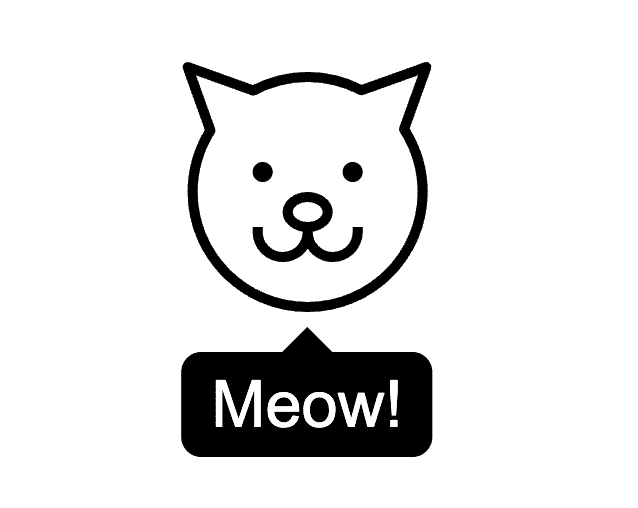
So the overall tooltip will look like this:
As for now, we aim to display the tooltip below the HTML element, but in part 2. of this tutorial I will explain how to add some additional usage options - including tooltip location/direction, show delay or closing time. But first, let's finally create an Angular Tooltip Directive.
Step 3 - create a tooltip directive
Directives can be created via Angular CLI in the same way as components:
ng generate directive common/ui/tooltip/tooltipMind the additional /tooltip in the path, as we want our directive to be generated in the already existing folder with a component.
Now, let's declare, inject and import a few objects that we will need inside our directive:
import {TooltipComponent} from "./tooltip.component";

@Directive({
  selector: '[tooltip]'
})
export class TooltipDirective {

  @Input() tooltip = '';

  private componentRef: ComponentRef<any> = null;

  constructor(
	private elementRef: ElementRef,
	private appRef: ApplicationRef,
	private componentFactoryResolver: ComponentFactoryResolver,
	private injector: Injector) {
  }
}
We start by importing our tooltip component class, as we will create its instance (via component factory) every time we want to show a pop-up tip to your users. We also need a few objects to be injected into our constructor:
- elementRef - we will use it to access the HTML element on which we place the directive tag, eg. a button or a link, to check its position in the browser window;
- appRef - reference to a whole app, that will allow us to inject our tooltip to the application HTML content globally;
- componentFactoryResolver - that will provide us with a factory for creating our TooltipComponent programmatically inside the TooltipDirective code;
- injector - that will provide Angular dependency injection for our TooltipComponent.
Then, we declare a componentRef property, to store the reference to a TooltipComponent, which we will be instantiating via the factory.
Remember also to provide a meaningful selector name for the directive. I just used a [tooltip] for convenience, but you can name it eg. [appTooltip].
Then, let's define an attribute that we will use to pass as an @Input() to our tooltip. Right now we just need a tooltip content, so you can name it simply a tooltip or something like tooltipText.
Again, for convenience, I stuck with the tooltip as it allows me to simplify the syntax, and use the directive easier. So instead of:
<div appTooltip [tooltip]="...I can skip the selector part and simply write:
<div [tooltip]="...That is of course, convenient, but may sometimes cause you trouble if a tooltip property conflicts with some other directives you may have, so watch out!
Step 4 - add basic tooltip logic
After having all the groundwork done, let's implement some tooltip logic. We will start by creating an actual tooltip on hover, or more precisely onMouseEnter.
@HostListener('mouseenter')
  onMouseEnter(): void {
    if (this.componentRef === null) {
        const componentFactory =
              this.componentFactoryResolver.resolveComponentFactory(
              TooltipComponent);
        this.componentRef = componentFactory.create(this.injector);
        this.appRef.attachView(this.componentRef.hostView);
        const domElem =
              (this.componentRef.hostView as EmbeddedViewRef<any>)
              .rootNodes[0] as HTMLElement;
        document.body.appendChild(domElem);
        this.setTooltipComponentProperties();
    }
  }
This method will be listening (thanks to @HostListener) to mouse pointer events relative to the DOM element, on which we have applied our tooltip directive. Event mouseenter is emitted each time the user's cursor starts to hover above our DOM element. When that happens, we first check if our tooltip does not exist yet (using its reference this.componentRef) and if not, we will move on with its creation:
- First of all, we need to use the resolveComponentFactory to get the factory that can manufacture our tooltip component;
- Then, we use it to create the component, passing the dependency injector;
- Next, we attach our component to the virtual DOM of the whole app, via the appRef;
- We also attach it to the real DOM via a standard document.body.appendChild;
- Last but not least, we define and invoke methods to set up the position and title of our tooltip.
This method for setting up the properties would like this:
private setTooltipComponentProperties() {
  if (this.componentRef !== null) {
    this.componentRef.instance.tooltip = this.tooltip;
    const {left, right, bottom} =
          this.elementRef.nativeElement.getBoundingClientRect();
    this.componentRef.instance.left = (right - left) / 2 + left;
    this.componentRef.instance.top = bottom;
  }
}
Method description is quite straightforward:
- Access to this.componentRef.instance allows the use of an actual instance of our component so we can set up its properties like tooltip text (I did access component properties directly, but I encourage you to define some setters instead);
- getBoundingClientRect() - allows us to get the HTML element location and based on that calculate the tooltip coordinates relative to a browser window.
That is how we handle hover, now it's time to take care of tooltip hiding:
@HostListener('mouseleave')
  onMouseLeave(): void {
    this.destroy();
  }

  ngOnDestroy(): void {
    this.destroy();
  }

  destroy(): void {
    if (this.componentRef !== null) {
      this.appRef.detachView(this.componentRef.hostView);
      this.componentRef.destroy();
      this.componentRef = null;
    }
  }
There are two situations in which we have to make sure that our tooltip hides: when we hover out (mouseleave event), and when the element on which we applied our angular tooltip directive is destroyed (ngOnDestroy).
And... that's it! Let's only wrap it up and we are good to go.
Step 5 - wrap it up in a tooltip module
Again, we will use the Angular CLI:
ng generate module common/ui/tooltipAnd inside the module, we will declare our component and directive, and will export our final Angular tooltip directive:
import { NgModule } from '@angular/core';
import { CommonModule } from '@angular/common';
import {TooltipComponent} from './tooltip.component';
import {TooltipDirective} from './tooltip.directive';

@NgModule({
  declarations: [
    TooltipComponent,
    TooltipDirective
  ],
  imports: [
    CommonModule
  ],
  exports: [TooltipDirective]
})
export class TooltipModule { }
And... done. Let's now give it a test ride.
Step 6 - give it a test ride!
To use tooltips we just have to add our TooltipModule in app.module.ts:
...
import {TooltipModule} from './common/ui/tooltip/tooltip.module';

@NgModule({
	...
  imports: [
	...
    TooltipModule
  ],
	...
})
And we are ready to apply the directive like this:
<div class="cat-icon" [tooltip]="'Meow!'"></div>or for a button:
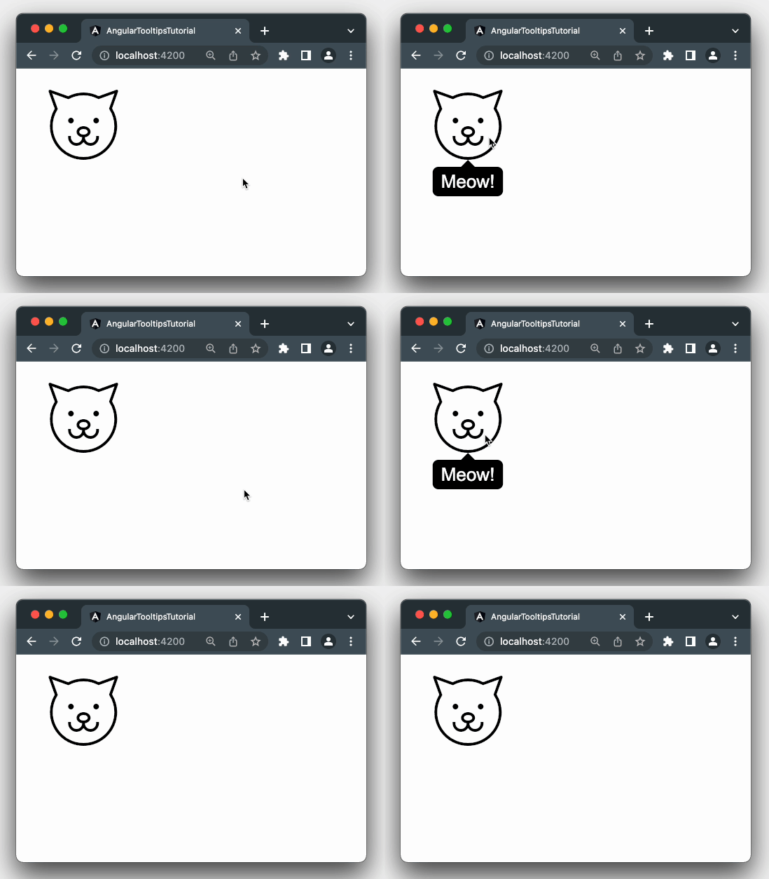
<button [tooltip]="'Some explanation'>Do something</button>And that was it - you can now hover above your button (or a cat 😺) and see how our tooltip appears:
How can we improve our Angular tooltips?
That was just a very basic tutorial on building your own angular tooltip directives. Check out the part 2 of this tutorial. in which we will extend this with many useful customisation and usage options. Part 2 includes:
- Tooltip hide delay / show delay;
- Tooltip position: above/below/left/right;
- Dynamic tooltips that follow the mouse cursor;
- Tooltip themes eg. dark vs tooltip background;
- Default options & default values like default delay;
- Tooltip showing and tooltip hiding animations;
- Support for touch devices / mobile devices.
Cheers! 🍺


